Library of Formatting Examples:Boldface/04A: Difference between revisions
Jump to navigation
Jump to search
(Created page with "{{LOFE:Navbar|prev=Boldface/03A|next=Boldface/05A|cat=Boldface}} {{LOFE:Example start |image-filename=103-04A.png|iw=40|tw=40}} {{LOFE:Blank}} {{LOFE:Blank}} {{LOFE:Blank}} {{LOFE:Blank}} OF A COLOUR MILL, {{LOFE:Tag|i}}For Calico Printers{{LOFE:Tag|/i}}. {{LOFE:Blank}} {{LOFE:Blank}} This Machine is delineated in fig. 3 of Plate 21. It has several properties which I think important in the process of grinding colours, either in a wet state or a dry. It c...") |
No edit summary |
||
| Line 1: | Line 1: | ||
{{LOFE:Navbar|prev=Boldface/03A|next=Boldface/05A|cat=Boldface}} | {{LOFE:Navbar|prev=Boldface/03A|next=Boldface/05A|cat=Boldface}} | ||
{{LOFE:Example start |image-filename=103-04A.png|iw=40|tw= | {{LOFE:Example start |image-filename=103-04A.png|iw=40|tw=45}} | ||
{{LOFE:Blank}} | {{LOFE:Blank}} | ||
{{LOFE:Blank}} | {{LOFE:Blank}} | ||
Revision as of 05:34, 20 November 2025
| Distributed Proofreaders: Activity Hub · Wiki · Forums · Blog | ||
| << (Boldface/03A) | Library of Formatting Examples Boldface |
(Boldface/05A) >> |
Correctly formatted text
[blank line]
[blank line]
[blank line]
[blank line]
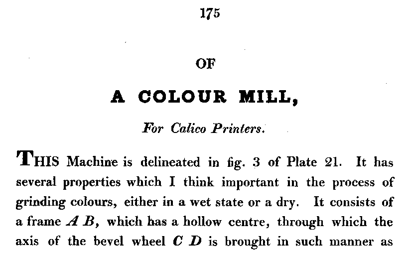
OF

A COLOUR MILL,

<i>For Calico Printers</i>.
[blank line]
[blank line]
This Machine is delineated in fig. 3 of Plate 21. It has
several properties which I think important in the process of
grinding colours, either in a wet state or a dry. It consists of
a frame <i>A B</i>, which has a hollow centre, through which the
axis of the bevel wheel <i>C D</i> is brought in such manner as
Headings
We do not mark heading lines where the entire line looks bold, so "A COLOUR MILL" is not marked as bold.
Complete and Incomplete Sentences
There's a comma at the end of "A COLOUR MILL," so the next line, in italics, is part of a mixed sentence, and the period goes outside the tags.
Typefaces
Mark "A B" and "C D" as italics, but not as bold. Note that even the upright capital letters on this page seem bold. It's just the typeface.
